
THE DEFINITIVE 2023/24 PREMIER LEAGUE HOME & AWAY KIT RANKINGS

The 2023/24 Premier League season is mere days away and what better way to look ahead to the new campaign than ranking each club’s home & away kit offering for the coming season?
Apparently it doesn't matter what your team’s kit looks like, so long as they win.
But that’s rubbish, we’re full of harsh judgement today. Each season is long and there’s nothing worse than watching your side turn out every week committing a fashion crime. Kits are symbolic and some stand the test of time, they inspire and act as a timestamp for ‘do you remember the season when we wore x kit’.
First of all, there’s a key difference between our list and others out there, unlike other rankings, we’ve coupled each club’s home and away kits to give them and overall ranking (so no complaints if the home jersey is miserable but the away shirt is a thing of beauty). Without further ado, let’s get to the rankings…
20. Luton Town

We owe a slight apology to the Premier League newcomers given their 2023/24 jerseys are a throwback to their threads throughout the 1970’s. The issue we have is their debut season in the Premier League (yes we know they have been a top-flight club prior to 1992) should be marked with a tad more enthusiasm than the kits on show here.
The away strip is basically an inverted version of the home jersey, not that we’re knocking it, well actually yes we are. Where’s the creativity? There’s nothing spectacularly wrong here but would it hurt to go bold given their journey from the National League to the Premier League in less than a decade? Also what on earth are those collars?
19. Arsenal
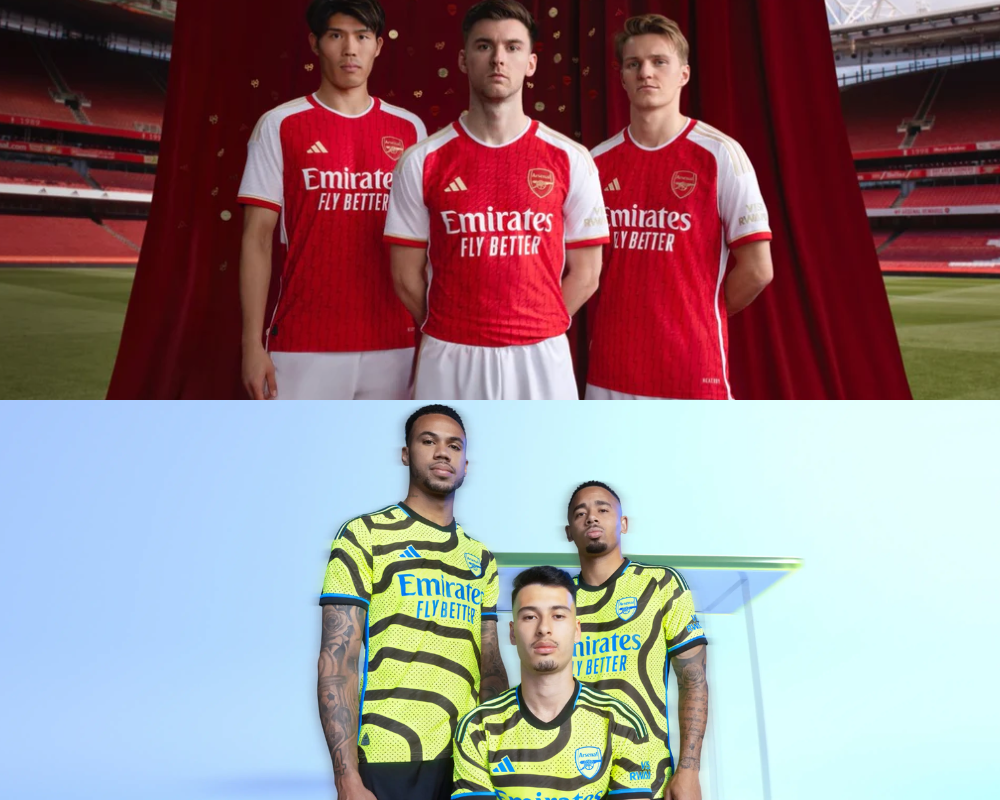
Arsenal took top spot in last year’s rankings with not one but two stunning jerseys. One year on and they’ve nosedived down our rankings with a classic example of how one jersey can completely bring down the overall rating (more on that later). The gold details supposedly pay tribute to the 20-year anniversary of the club’s 03/04 invincible side, Adidas actually managed to balls this up in the finer stitching which depicts all of their games from that term forcing them to pull the shirts from sale. Other than that, the home jersey is a pretty classy effort.
But we absolutely have to talk about the away shirt which quite frankly, makes our eyes bleed. The ‘shock-yellow’ top is allegedly inspired by the map of Islington borough (who makes this tosh up?). Fans are rightly furious, one columnist for the Telegraph called for ‘someone to intervene’, bit late for that, the damage has already been done.
18. Burnley
In all honesty, we’re not too put out by Burnley’s home jersey. It’s a classic top but it seems as though Aston Villa’s batch of home shirts detoured Birmingham and headed up the M6 instead (more on that later). The 1994 inspired top features a proper collar which gets a thumbs up from us, not too shabby at all.
But similarly to Arsenal, let’s sit down and talk about the away design. Burnley have stated both jerseys are throwbacks to their 1994 collection, but closer inspection will show you this really isn’t the case. Burnley’s 1994 away effort was actually yellow with vertical pinstripes, not a horrendous big bold vertical paint brush sash. The more you look at it, the worse it gets. I mean it doesn’t even feature on the back, where’s the consistency? Needless to say we’re not fans, shame too considering their home top is a pleasant endeavour.

17. West Ham
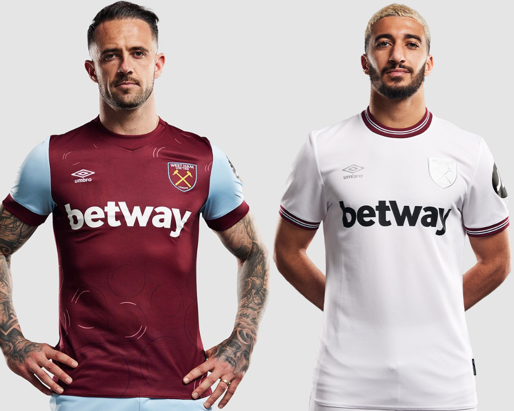
Another big faller on our list following their third place finish on last year’s rankings. West Ham have gone from satisfying creativity to devoid of ideas with their half-arsed introduction of bubbles. We all know the club's anthem ‘I'm Forever Blowing Bubbles’ is a significant part of West Ham's identity, but a lot more thought should have gone into this. It could’ve been a belter done right, but quite simply, it hasn’t.
The away top, as plain as it might appear to some people, is a large improvement on their home effort. The iridescent logos give off a whiteout appearance which we’re big fans of, the long sleeve edition looks even classier somehow and the capability of purchasing the jersey without sponsors is a very tempting option.
16. Wolves
Last year Wolves got a good kicking from us finishing bottom of our rankings with a set of uninspiring kits. This year they’re marginally improved, but not by much. In truth, their rise can be completely attributed to their vastly refined home jersey which fans can be happy with after last year’s calamity. No unnecessary panels, no dodgy collar, no random lines, this home strip is a major upgrade with the collar matching the sleeve cuffs and subtle pinstripes.
Now we move on to why the Wanderers feature low in our rankings again. I mean a jersey that features your nan’s carpet all over the front cannot inspire, though supposedly it’s by the geometric architecture and tile patterns found around the Iberian Peninsula (yeah okay mate). Not having it, the pattern doesn’t even flow on to the sleeves.

15. Tottenham
Let’s begin this entry by talking about the fact that Spurs have actually yet to officially release their away strip. It’s the week of the season and you haven’t revealed anything other that your home tops? No wonder you’re known as bottlejobs. Are we sure it isn’t 2019 or 2021 because we’ve seen the same home shirt multiple times now? Honestly where’s the creativity?
So we have to move on to a jersey that has been strongly speculated to be Tottenham’s 2023/24 away jersey. There are plenty of leaks out there that shouldn’t take too long to find on the internet and this one in particular keeps popping up. It’s worth saying that we actually like it, from the armpit panels, sleeve cuffs, collar etc. Ultimately though it hasn’t been released, and we ask the question, why?

14. Liverpool

Truly a game of two halves when discussing Liverpool’s 2023/24 kit offering. Let’s start with the home shirt which has been inspired by the Bill Shankly sides of the 1970’s, truly a golden era for the club. You can say it lacks imagination - two years in a row now, but there’s nothing wrong with this clean, balanced, consistent effort.
The away strip definitely brings the overall ranking down, how could it not? Clearly inspired by the 1995-96 away shirt (hence Robbie Fowler’s presence in the kit release), the modern take leaves so much to be desired you almost want to shake the kit designer. All you can see is the Microsoft Excel logo - and once you see it, you cannot unsee it. Why did this shirt need a modern take? Go back and Google the original, the design was a cult classic - who signed off on changing it? We all demand to know.
13. Crystal Palace
It’s a bit of a plummet down the rankings for Palace who took the runner’s up spot last year with their Art Attack inspired jerseys. Dedicated to their 10-year anniversary since promotion, the home shirt features a silhouette of the original Crystal Palace, where the club was founded in 1861 and played from 1862. Listen, we like the concept, but we’re just not sure of the execution - especially when you completely butcher the round neck & sleeve cuffs.
In the late 70’s & early 80’s Crystal Palace loved a sash design on their shirts, hence the reintroduction here on their away kit. Sky blue and white hark back to the club’s origins from 1861, fair enough - but why improve the collar and sleeve cuffs on the away jersey to leave the home shirt looking half-finished? Better execution needed all around here Palace, take note.

12. Fulham

Two kits on either end of the spectrum for Fulham this year, can you guess which is which? The image on the left is a visual representation of going to the cinema and watching Oppenheimer or Barbie, quite literally.
Let’s start with the home top, it’s marmite right? No, no it’s not. Typically different sleeve colours would be considered a crime against football kits, utter sacrilege, but in this instance it just works and we won’t have it any other way. The button collar gets the seal of approval from us.
Are we sure the away jersey wasn’t released in conjunction with the Barbie movie hitting cinemas? I mean the photoshoot was literally executed with a pool in the background for crying out loud. Worse yet the shorts and socks and the same colour. Striking (stinking).
11. Everton
Another set of kits, one good, one bad. Why can’t teams release two decent kits in the same year, is it really too much to ask? We have to start with the Toffee’s home top which we really, really like. The collar and sleeve cuffs pay homage to Goodison Park’s famous Archibald Leitch pattern, the design has been a feature of Everton’s stadium since 1909 - it’s a home run in our book.
Again, the overall ranking is severely hindered by the monstrosity that is Everton’s 2023/24 away shirt. Allegedly inspired by the away kits worn by the club from 1992 to 1996 (we struggle to see that), we fail to understand why clubs can’t understand the concept of a torso design flowing on to the sleeves - maybe that would make it slightly more bearable, then again probably not just look at it.

10. Newcastle United
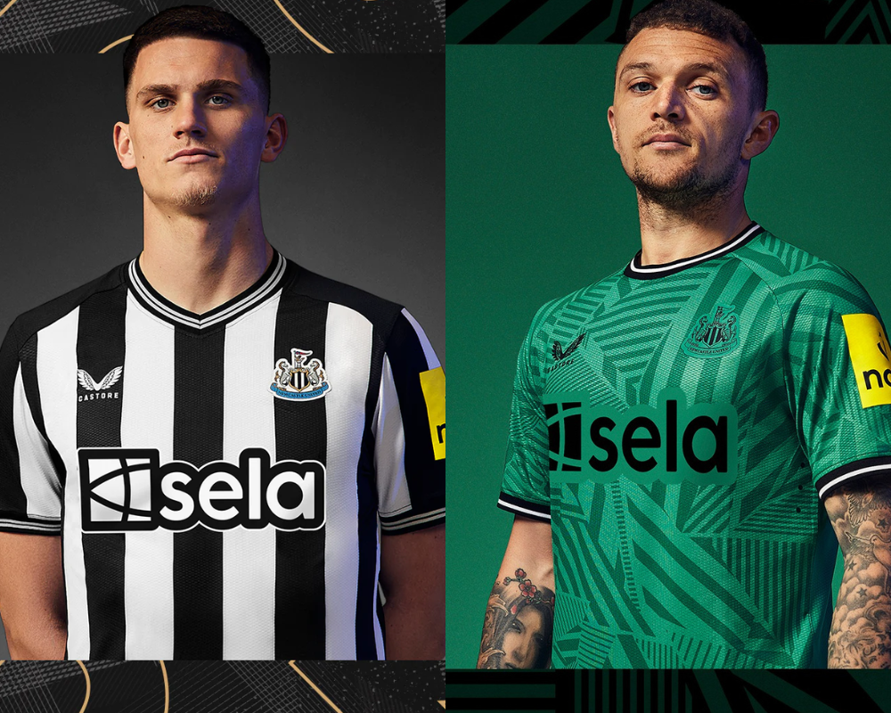
We’ve reached the top 10, somehow. The team just cracking the top half is the city of Alan Shearer and Sam Fender. As ever there’s one rule and one rule only for designing the Newcastle home jersey - don’t ever, ever, mess with the black and white stripes. No damage done here, if anything the pinstripe v-neck and sleeve cuffs are simple and tidy. A top fit for playing Champions League football.
For the second year running Newcastle’s away jersey will nod to the land of their owners. The tonal stripe design is funky to say the least, but you cannot knock it for lack of creativity. Akin to the home jersey, the round neck and sleeve cuffs are consistent - never underestimate how important that is. All in all, not a bad effort.
9. Aston Villa
As mentioned earlier, it seems as though we’ve had an accidental kit swap between Burnley and Aston Villa. The first kit to feature the newly redesigned crest (as voted for by fans) is somewhat ‘meh’ if we’re being completely honest. The home shirt is okay, it does look like a peak Sean Dyche era Burnley top with the sponsor. The subtle torso design supposedly depicts a print of soundwaves taken from fans singing on a matchday, yeah okay.
The white away strip features a lion design (that’s more like it), which we do rate. The biggest gripe we have about this shirt is the small blue tab on the collar, yes the shorts have the same shade of blue but come on grow up. Just for complete transparency, if I were a Villa fan I’d definitely be getting the scissors out to remove that tab on the collar - it just ruins an otherwise solid jersey.

8. Manchester United

A bit contentious this one, so let’s dive in. Something look slightly different about the sponsor on the front? That’s because they’ve decided to use two lines instead of stretching it out across the front - good decision.
Anyway, the home shirt is a typical Manchester United top, there’s a subtle geometric pattern that you’ll only really see by squinting. It’s inoffensive, the crossing collar is harmless and there’s not a whole lot more to it. Definitely falls into the ‘meh’ category.
Now we move on to the main event - the away offering. A war has enraged since its release with both sides shouting from the rooftops over their love or distain for the jersey. We fall into the camp of the former. Don’t get us wrong there are a lot of stripes, but that doesn’t put us off. Pinstripes in the middle of stripes? Sign us up, thick collar? Yes please. The camo green, cream and red all work together really, really nicely.
7. Brentford
So Brentford’s 2023/24 threads took a while for us to make our mind up over. First of all it’s worth pointing out that we’re judging their third jersey instead of their away shirt - why? Because they’ve rolled over their top from last year. Affordability and sustainability boxes checked here, extra marks from us Brentford, kudos.
The home shirt is hard to enjoy. The black panels on the collar, the red extension on to the white stripe? No, nope. Look a little closer though and you’ll see that the red stripes fade to black at the end of the torso, that we like - especially with black shorts. Hit and miss in one.
The third jersey is bold, let’s have it right. In fact Brentford said this in the press release, “Designed to be worn casually and socially, whether that is to the park, on holiday or on a night out”. Not so sure about that mate, but hey it’s not terrible so it must be okay.

6. AFC Bournemouth

Bournemouth up next. Last season they finished 5th in our rankings, so this year they only drop one place missing out on the Champions League places of kits for a second year in a row.
We liked their jagged stripe home look last year, but we had a major gripe with their stripes not flowing on to the sleeves. They’ve returned to a classic stripe look this year - but they have addressed the sleeves. The shirt is clean, simple and effective, good work Cherries.
After addressing the home shirt, Bournemouth’s kit designer has had an absolute nightmare and had a change of heart with the away top despite the attractive looking colours. The waves-inspired design is cut off with half an attempt of a round-neck collar, honestly we give up. All you had to do was follow the damn train CJ!
5. Chelsea
A 16th place finish last year clearly kicked Chelsea into gear with a big jump in our rankings this time around.
The Blues claim the home strip is inspired by the 90’s, though we’re not convinced looking at the iridescent crest that looks different every time you glance at it. In fact, plain white logos could’ve pushed this entry higher up our rankings with very smart gold detailing underneath the armpits and sleeves. The fact the currently sponsorless shirt is unavailable for purchase until one is found is scandalous if we’re being honest.
Once again we have another club who have yet to release their away jersey. Pathetic. The season literally begins this week. It’s a shame too because their leaked away shirt looks half decent with a geometric pattern and a sleek collar/sleeve cuffs.

4. Manchester City
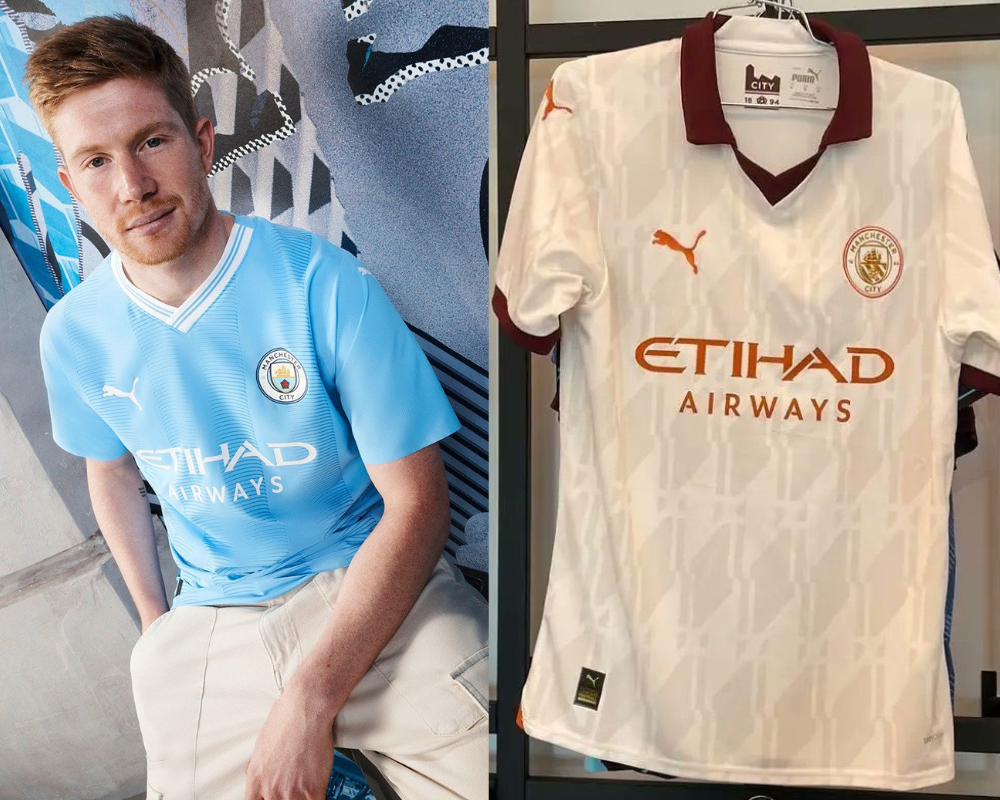
Guys, come on. We’ve really got to get our s**t together here, how on earth are you incapable of releasing all of your jerseys before the season begins?
Anyway, Manchester City’s home shirt. Not bad if we’re being honest given it’s a tribute to the 2003/04 top - their first season playing at the Etihad Stadium. The collar is lovely but it doesn’t wrap around the back of the neck - can I ask why? The torso design doesn’t stretch to the sleeves, but then again it didn’t 20 years ago.
The still to be released away shirt is both hit and miss at the same time. We’re a fan of the design, and the burgundy collar - but why is the crest and sponsor detailing a shade of orange? Shouldn’t it match the collar? Ffs! Had it all been burgundy we might’ve been looking at the best jersey on this list.
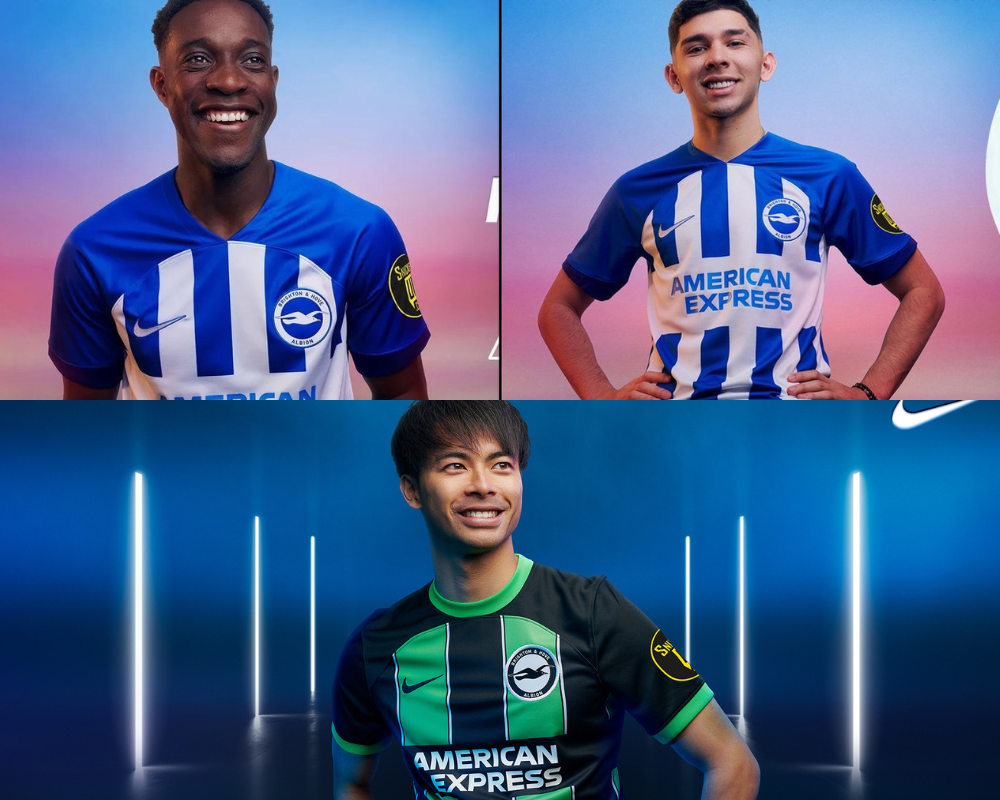
3. Brighton & Hove Albion
Brighton placed 15th on our rankings last year, disappointing given their catalogue of smart-looking jerseys throughout the club’s Premier League era. Thankfully last season was just an off-year.
This might be the only set of kits on the entire list where we don’t have a gripe about the stripes on the torso appearing on the sleeves (not that Nike’s kit templates allow for it anyway). The home jersey is classic Brighton, a true improvement on the motorway symbol looking monstrosity of last year.
At first glance the away shirt is a replica of the home with black and green replacing blue and white, but look closer. There are thicker stripes (with finer white pinstripes) and a lovely round-neck/sleeve cuff combination. Good work all around Seagulls, welcome back to the top table of kit rankings.
2. Sheffield United
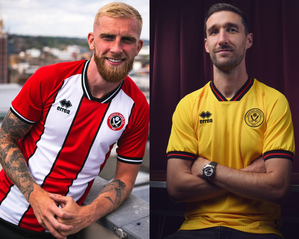
Sheffield United are back in the Premier League, thankfully they’ve brought some style with them. We’re willing to concede these kits aren’t everyone’s cup of tea, but it’s our list - so deal with it. Errea, the kit manufacturer, have done the Blades a solid with the collar - we love the cut off base and how it matches the sleeve cuffs.
What more can you say about the home jersey, classic Sheffield United. Red and white stripes supplemented by a black trim throughout - it just works superbly well. It’s a nod to their 1996-1998 threads, and at a quick glance they’ve nailed it with a modern take.
Yellow kits are an all or nothing affair, too bold and it looks daft, too plain and well, it’s just too plain. Granted this does give us Watford vibes, but Watford fans would salivate for a shirt like this. The red and black trim works wonderfully well against the yellow, changing the colour of the badge for the jersey is a lovely little touch.
Nottingham Forest
Congratulations on surviving your first season back in the Premier League Nottingham Forest, your reward? A set of stunning kits available for purchase immediately without a sponsor, you’re being spoiled - until you see the cost of a jersey albeit.
You can criticise the home shirt for a lack of invention, or the fact it looks like a recycled Aberdeen top - but who cares? Remember the saying ‘less it more’? Less is certainly more in this instance with a lovely round-neck collar and a white trim that runs down the side from the armpit. The tidied up Adidas logo hasn’t looked better on any other kit, it’s a modern classic.
Commemorating Argentina on their World Cup win by replicating their kit? A risky move - particularly when you have three Brazilians in your squad. It’s bold, but the wavy sky blue stripes work - especially when they’re supplemented by black detailing throughout. Well done Forest, you take top spot.
